4 min read
Improved development efficiency through a scalable design system
As the sole designer, a scattered and inconsistent UI was transformed into a structured, component-based design system, giving Cobothub's growing product team a shared visual language and a foundation built to scale.
Project overview
As Cobothub's software grew, the absence of a shared design language made consistency impossible to maintain. Components were built ad hoc, styles were duplicated and contradictory, and there were no accessibility standards in place. Every new feature added more design debt, slowing both the design and development process.
A complete design system was built from the ground up following Atomic Design principles. Starting from a refined brand identity and accessible color tokens, the system grew into a documented library of reusable components covering everything from atoms to complex organisms, all maintained in Figma and ready to hand to development.
- Product Manager
- Frontend Developer
- Backend Developer
- Robotics Specialist
- Project Manager
What I worked on
- The starting point was a full brand identity overhaul: outdated visual guidelines were analyzed and rebuilt to reflect the product's maturity.
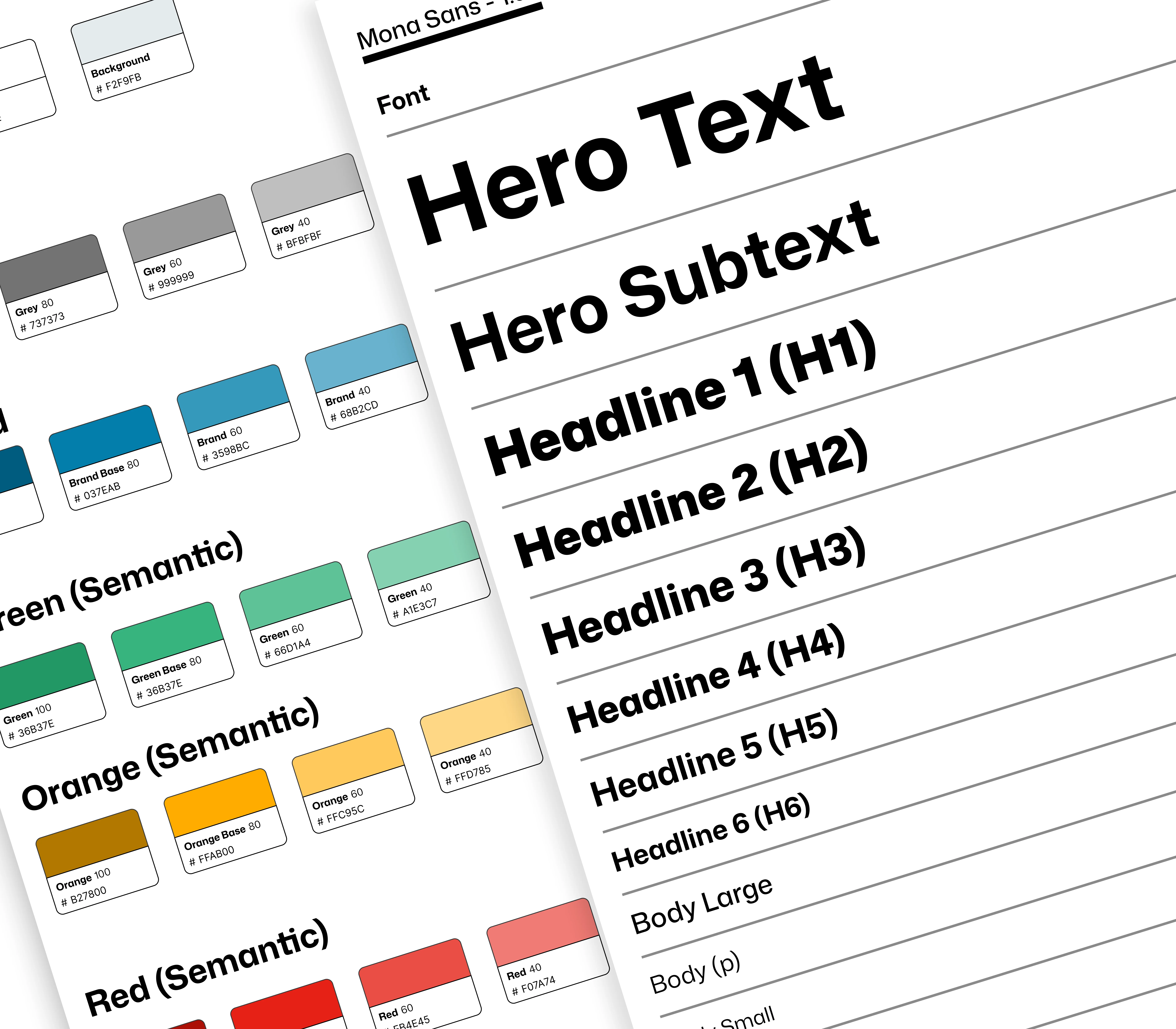
- Color tokens and a typographic scale were defined with WCAG accessibility standards as a strict requirement from day one.
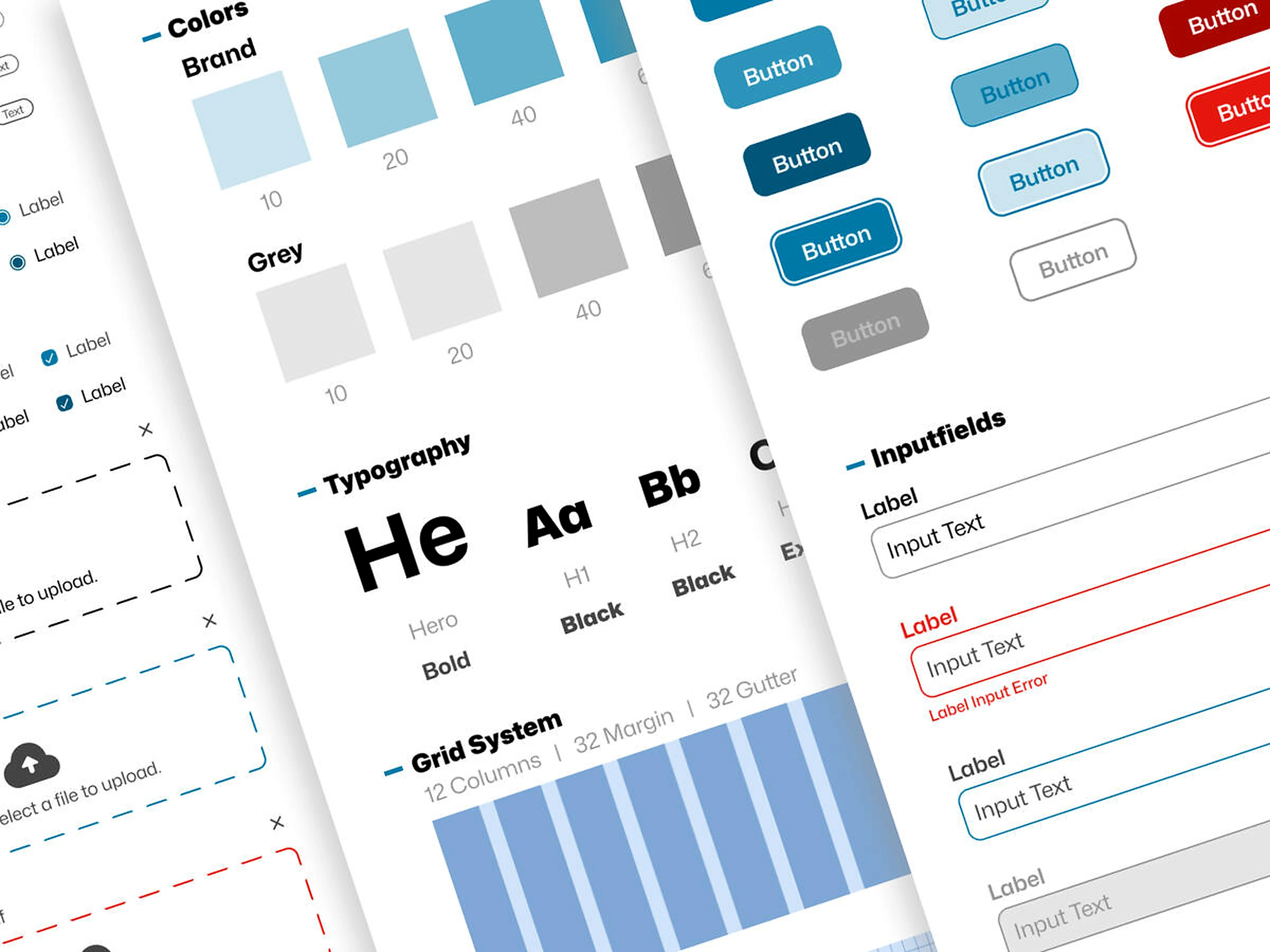
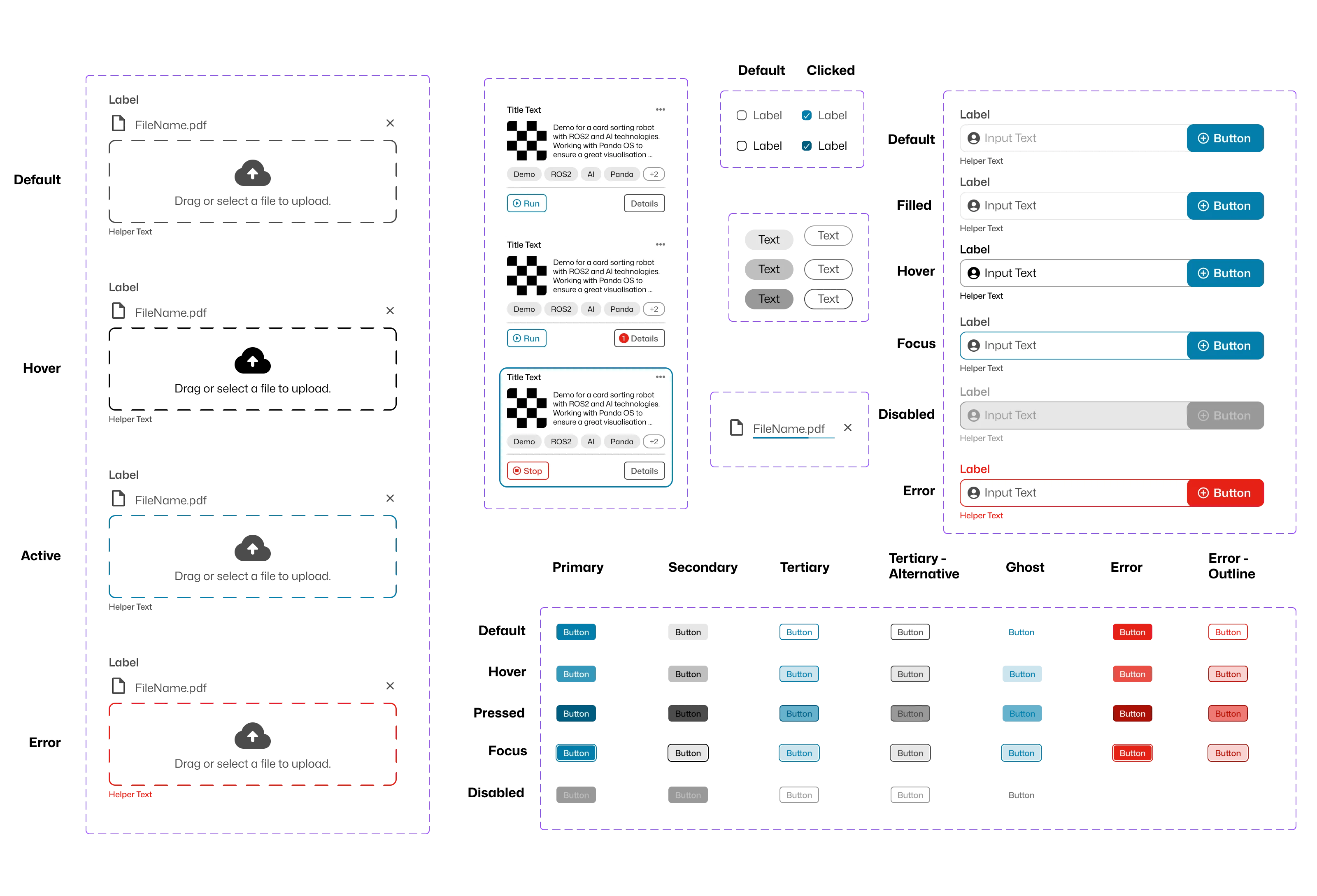
- The component architecture was structured according to Atomic Design, spanning atoms, molecules, and fully composed organisms.
- Every component was built and documented in Figma, from basic buttons to complex data table patterns, complete with variants, states, and usage notes.
- Usage guidelines and design principles were established to ensure consistent application across the entire product.
- As the sole designer throughout the project, close collaboration with developers ensured accurate usage of the components.
My approach
Stakeholder alignment and audit
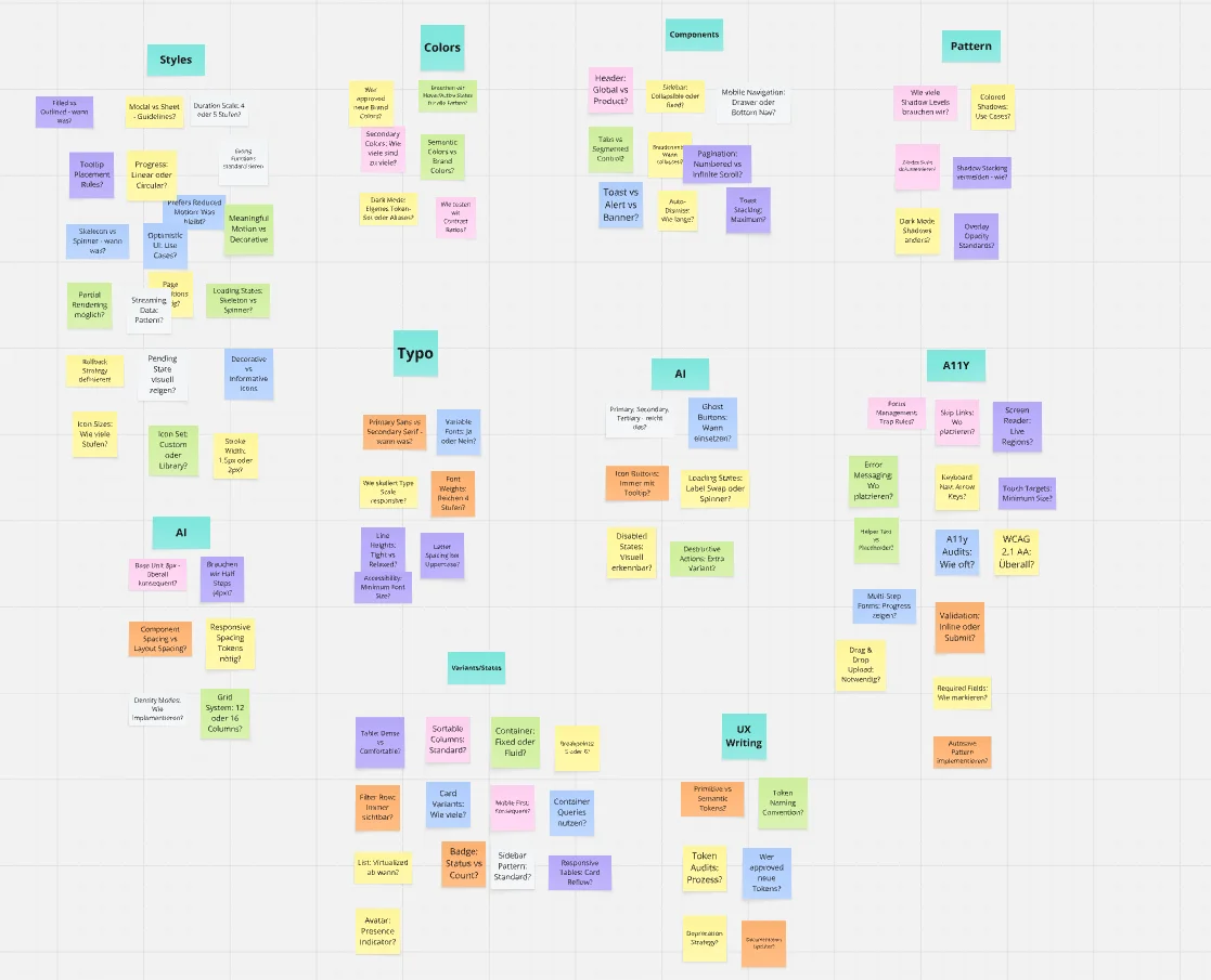
The project began with a structured briefing to align on goals, priorities, and constraints with all relevant stakeholders. The existing UI was then audited systematically: every screen, component, and style was catalogued to expose inconsistencies and identify what was worth preserving.
Brand identity and token foundation
Before any component was built, the visual foundation had to be solid. Working from Cobothub's existing brand direction, a refined identity was established: accessible color tokens, a clear typographic scale, spacing rules, and iconography guidelines. Accessibility compliance was treated as a baseline requirement throughout, not an afterthought.
Building the component library
With the foundation in place, components were built from the ground up following Atomic Design: atoms first, then molecules, then fully composed organisms. Each component was documented in Figma with defined variants, interactive states, and usage guidance, ensuring development could work from the system without ambiguity.
Handoff, documentation, and adoption
A design system only delivers value if the team actually uses it. Detailed documentation was written for, and syncs with the development team ensured accurate implementation. The system was treated as a living product, evolving alongside Cobothub's software.
The Impact
A single source of truth eliminated visual inconsistencies across the product, creating a coherent user experience for the first time in the product's history.
Reusable components reduced development overhead, freeing the team to focus on new functionality rather than rebuilding UI from scratch.
The component library was built to WCAG AA standards, bringing the product into compliance and making it usable for a broader audience.
The Atomic Design architecture made it possible to design and build new screens significantly faster.
Are you interested in collaborating?
Let's connect and explore how great design can make your product more engaging.